Re-opening the Renaissance Window
Kieran Hearne
Overall I am happy with my final outcome though I feel there are many aspects that I could have improved on. One of the biggest aspects I overlooked when creating my 3D navigation was sound and I should have created and used more sound effects in the module as looking at now makes the work seem unfinished. This could have added to the effect of the navigation and the interactivity with the user.
Looking back I should have done more research on applications for new technologies and thought how I could have applied 3D navigation to them to improve the functionality and aesthetics of them. I feel more study was needed to create more exciting animations and to improve my competence with the software I was using. Researching other things such as 3D software like 3D STUDIO MAX could have aided me in my production or even looking at free software like Blender could have helped me create a better piece of work.
Much of my work was limited in what I could have achieved because of my lack of knowledge of the software I was using. In the future I will be extending my knowledge of programs and software that could help me when designing something of this kind. I should have tried more experimental ways of displaying the 2D images in the software.
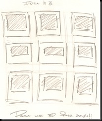
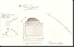
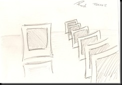
Something I feel let the project down was not utilising my research as much as I should have and pulling in more aspects from different ideas that I had come up with to create a more visually pleasing navigation that could make more use of the Z axis of my 3D design. When developing my final piece I should have looked more into the movement of the camera and maybe used more exciting rotations to put emphasis on the 3D environment. That said I am pleased with getting the camera to move how I wanted it too and feel any more movement would have taken the focus from the images being displayed.
The design that I came up with could be applied to existing websites in functional way if it were to be developed further in software such as Flash, this would also give the user a level of interactivity that it hasn't got at the moment. It would also allow the images to be interchangeable using XML.
Overall I am pleased with my development of skills in After Effects as I found navigating the 3D environment difficult at the start of the project. If I had developed the skills at an earlier stage in the design then this would have allowed me to build the navigation to a higher standard and made the experiences for the user more aesthetically pleasing.
Looking back I wish I had used video recordings and other raw elements in my design to create something with more realism. No text was used in the design and this could have been helpful to show the user what the navigation was for.
I am disappointed with my choice to design a photo album as this limited me to the type of navigation I could have used, as well as the information displayed. A further problem I encountered was that the images I used had already been compressed for web design and hosted on the internet.
As this module is about navigating 3D space I am happy with my work in some ways as it did hit the main objective but this type of metaphor has been used many times before, and it lacks originality. This idea could be developed further to navigate directly from one image to another in stead of navigating through the images one at a time. I would have liked to have displayed more images but the animations would have become even more repetitive than they already are.
The idea doesn't have to be just for pictures its possible to lay out different types of information this way. This would allow the user to navigate information such as video text and other graphics in a 3D environment.
I'm happy that the final video worked the way I wanted it too, it does explore 3d space which is where web design and other media design is heading. There are other possibilities for this navigation. Maybe it could be turned it into an application for things such as the iphone or other hand held devices.


